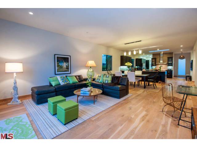
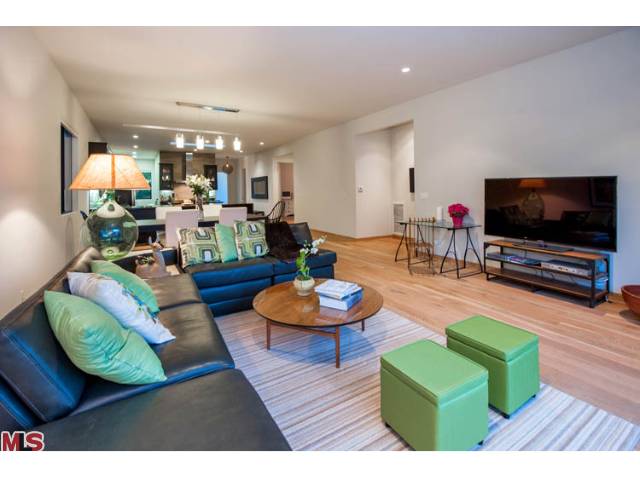
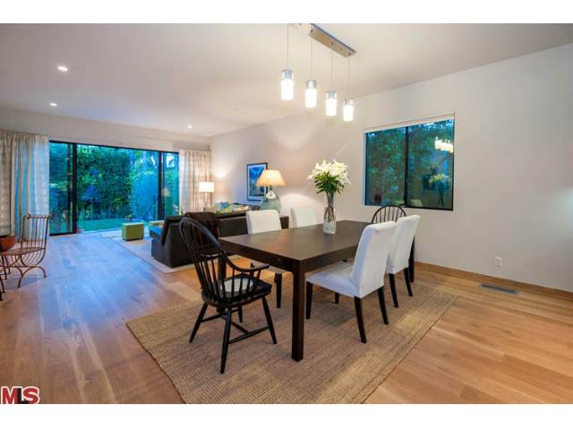
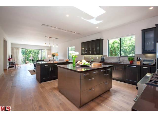
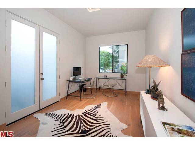
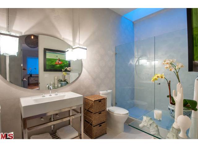
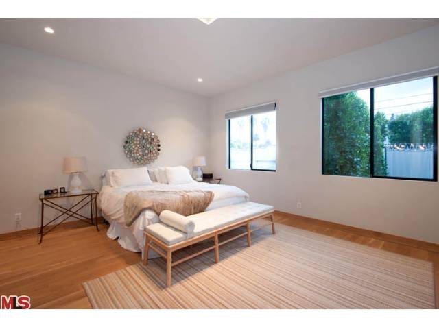
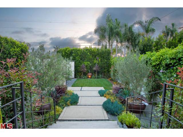
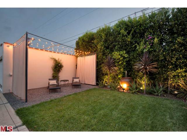
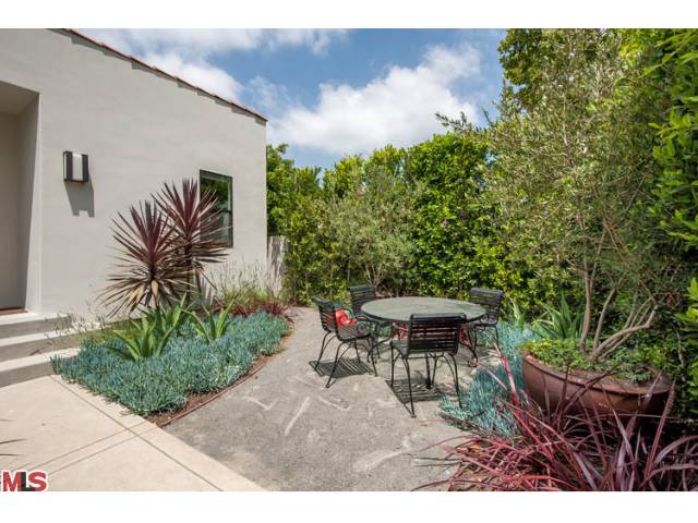
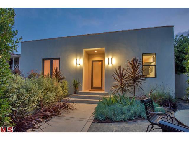
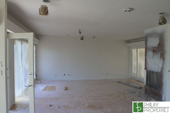
 I had the pleasure of seeing this property in person this week, and not only do I like the concept, but definitely liked the execution as well. The property was a Spanish style side by side duplex that the developer converted into a stunning wide open loft like four bedroom showstopper. They used as a base my favorite wood flooring choice at the moment throughout the home, wide plank white oak floors. The attention to detail is first rate, including the front bathroom (shown below) with wallpaper pattern like design ingrained into the tiles, which to be honest I had never seen before. There is a large chef's kitchen, a multitude of skylights allowing natural light to flood the property, and an ideal open floor plan leading to a truly relaxing backyard with great landscaping. I like how they kept one of the duplex doors on one side of the front to allow for a home office as well. Lying in a prime "Beverly Grove" neighborhood by all the chic shopping and restaurants on Melrose, this one is not to be missed.
641 Kilkea Dr, Los Angeles
$1,499,000 4 Bed 3 Bath 2,312 Sq. Ft 6,552 Lot Sq. Ft
Listing & Pictures by Sally Forster Jones & Daniel M. Weiser - Coldwell Banker-BH South
If you would like to see this stylish property in a prime location, please feel free to contact us anytime @ 310.600.9172 or email eric@smilayproperties.com.

