Remodel

Modern Meets Traditional With Land & A View In Style in Studio City

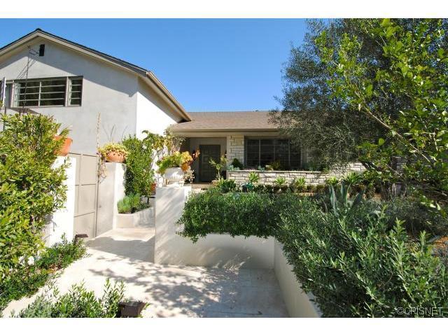
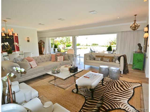
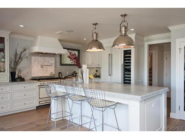
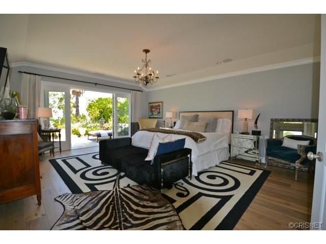
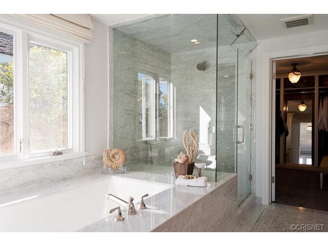
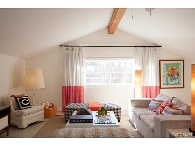
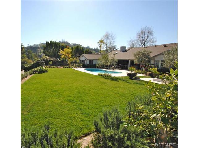
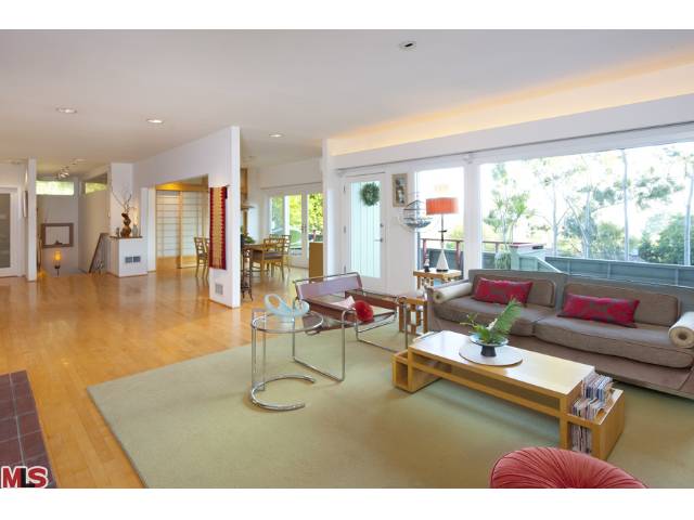
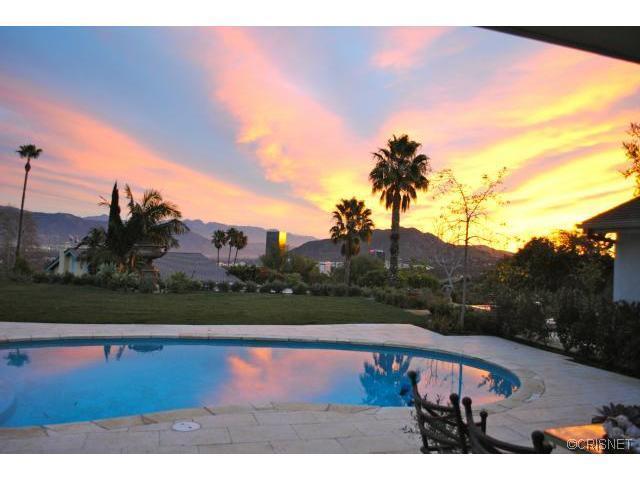
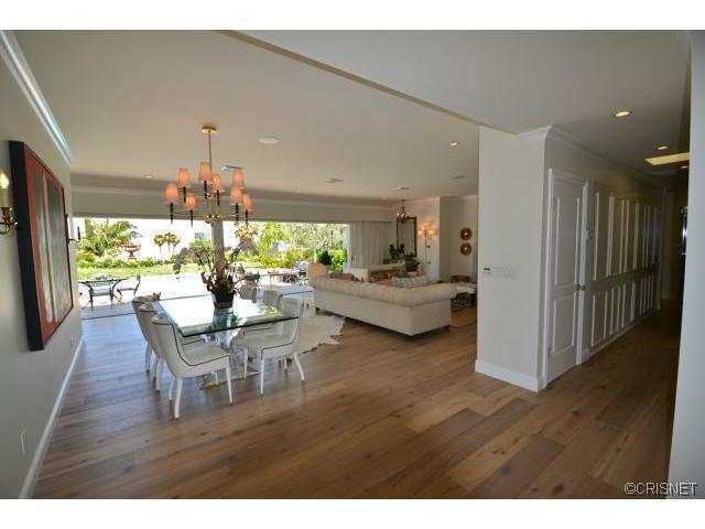
I had the pleasure of seeing this property in the hills of Studio City this past week, and I must say I really really liked it. The owner, who I met with and was great, did a fantastic job on the remodeling of the property and was able to create a nice mix of traditional and modern finishes that will appeal to a wide variety of potential buyers. They took what was a nice but dated property in a great location on a large lot and turned it into a special trophy property. The base of the home is the 8' wide white oak flooring, open spaces, and disappearing walls of glass (a personal favorite of mine). The chef's kitchen has been updated with "marble counters, custom-milled high-end floor to ceiling cabinetry, farmhouse sinks, and all top of the line appliances(Thermador, La Cornufe, Bosh)." The landscaping was clearly professionally done from the water feature in the entryway to the multiple private patios off of the bedrooms to the lush backyard with pool, fire pit, and plenty of green grass to run on. This property has great valley views, and is simply a must see if you are looking for a home in this price range.

3428 Wrightview, Studio City

$2,498,000 4 Bed 4 Bath 3,654 Sq. Ft 15,340 Lot Sq. Ft

Listing & Photos courtesy of Michaela Tupta-Cadiz - Nelson Shelton & Associates

If you would like to see this stunning home, please feel free to contact us anytime @ 310.600.9172 or email eric@smilayproperties.com.

Remodeling Updates; Los Feliz

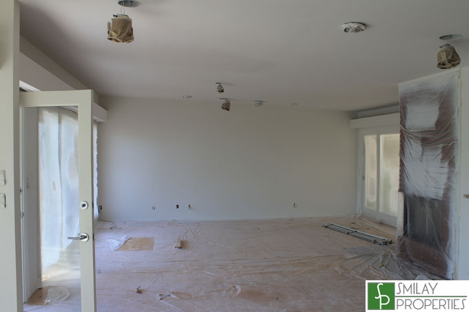
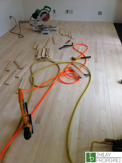
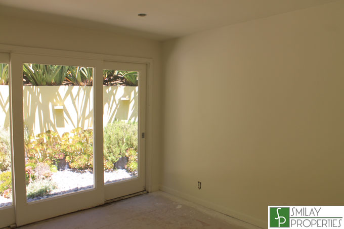
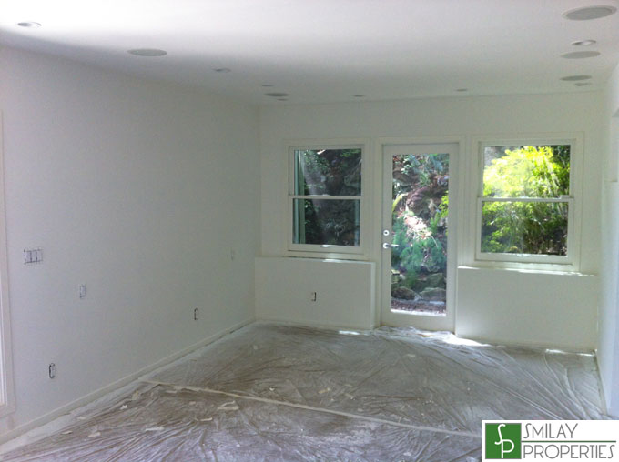
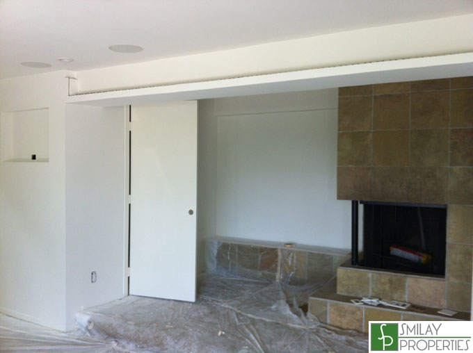
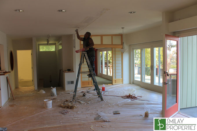
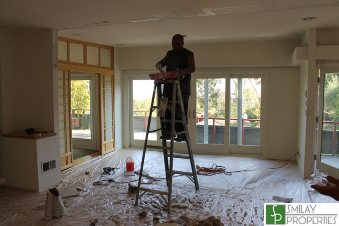
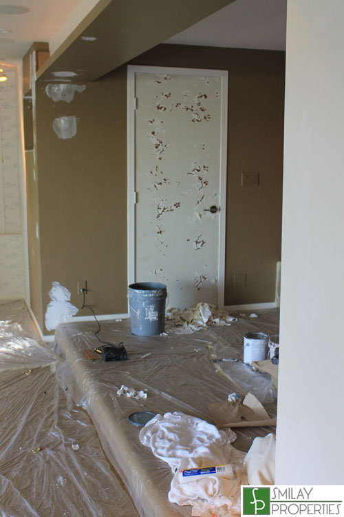
Progress continues on the previously posted remodeling project I am managing for a client in the coveted "Oaks" neighborhood of Los Feliz. Everything is looking good, and besides the rain slowing us down from painting the outside this week, the work appears to be on schedule. The interior is almost 100% done by now. You can see the new wood flooring laid down, as well as the entire inside has been painted. The flooring just needs to be sanded and stained, as well as the flooring that was already there needs to be refinished. It is somewhat difficult to tell by the pictures, but for the main living space we went for clean white gallery like walls. The space exudes clean lines and modern living allowing the next user to have different directions in which they can take the space. It is a clean pallet and ready for one's interior design skills to run with. The bedrooms are swiss coffee, which is a sort of off white, and is a bit more "homey" if you will.

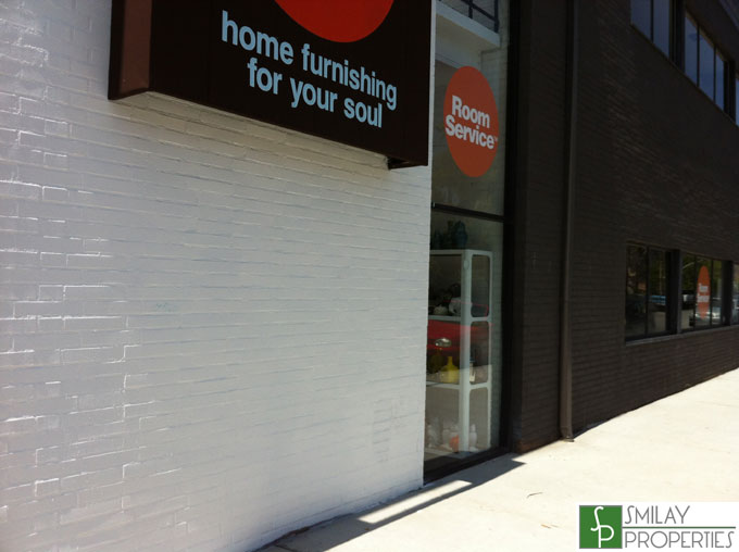
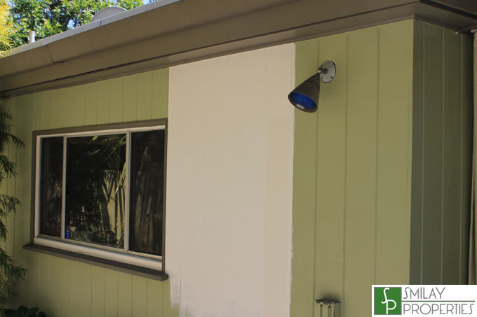
As you may or may not know there is about 100 different white paint colors to chose from. I wanted to go with a very Palm Springs Mid-Century white on the outside with grey borders, similar to what the outside of Room Service on 3rd St did (pictured after the break); however, I think for a single family home with a lot of area to cover the pure white will just be too much. We decided to go with the more off white, which is the strip on the right of the outside. It shows a bit beige here next to the pure white, but think it will read off white when complete and be very visually appealing and more functional in terms of not showing every bit of dirt, etc. This is obviously the main component from an aesthetic perspective, so was treated with the utmost importance, and it's execution will be key.

This has been a good minor project for the house and I look forward to seeing the end result, which I think is going to be stunning. I look forward to sharing the finished pics with you soon.

Let The Remodeling Begin

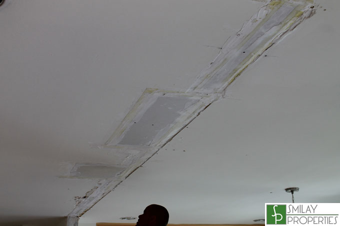
My client's, who reside outside of the country, have entrusted me with a great deal of responsibility in both assisting them with the purchase and now remodeling of this home. Trust me, I do not take this responsibility lightly. They purchased the property sight unseen based on pictures over the internet and opinions from me, and are now in the process of remodeling it. I gave my recommendations on what should be done and how, and we discussed basic parameters and a budget, and now I am managing the work for them. We are refinishing floors, adding new wood flooring in the upstairs bedrooms, removing wall paper, de-personalizing the space, re-coating the front deck, painting the inside and the outside, as well as fixing a few functional issues uncovered during the home inspection. I met with a multitude of sub-contractors do to the individual portions of the project to get estimates, but eventually settled on giving the entire project to a general contractor to oversee, mostly due to experience and a considerably lower price. We have signed the contracts, and the work has begun.

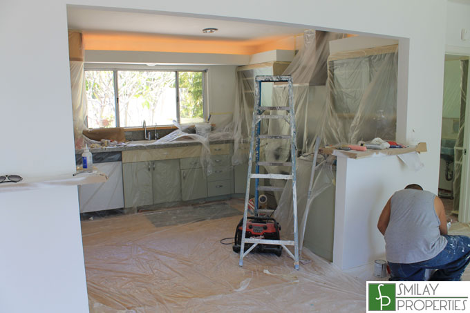
Above was how my client's purchased the property. Notice the sort of random mini-wall "dividing" the dining room area and the kitchen. Seeing as how it serves no purpose, and only makes the space feel smaller, the first order of business was to remove it. Loft like open space is much better, and I think it does wonders for the main living space. Day one, it is gone.

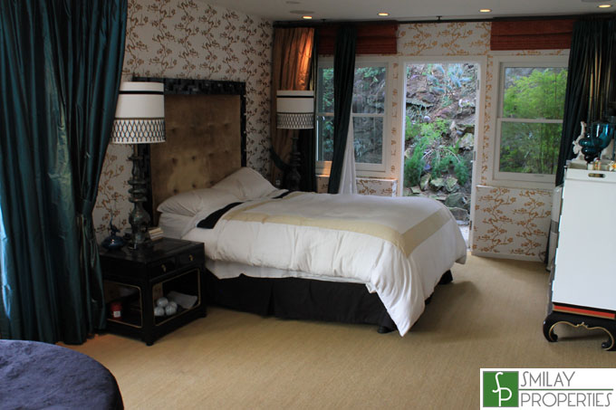
Master Bedroom at time of purchase.

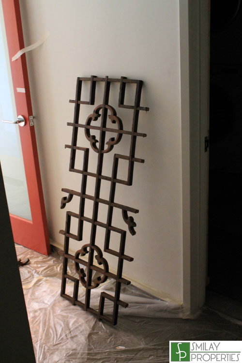
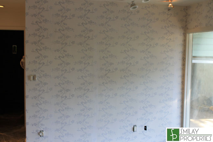
As you can see it had Asian influenced wallpaper, as well as Asian style ornaments in the room. We wanted to make the space more neutral, as well as portray a more clean line mid-century modern style, so we ripped the ornaments down. It is a bit of a pain, but the workers have treated and are in the process of taking down the wallpaper before we will paint it.

Pictures by Eric Smilay for Smilay Properties

The project should take a couple weeks, so keep checking back for updates. I think the home is going to look more modern and sleek once I am done putting my designing touches on it, and can't wait to see the finished product.

This property will be available once the remodeling is complete, so if interested in this home please feel free to contact us anytime @ 310.600.9172 or email eric@smilayproperties.com.